RE-BRAND / CASE STUDY
Shock Raw Energy
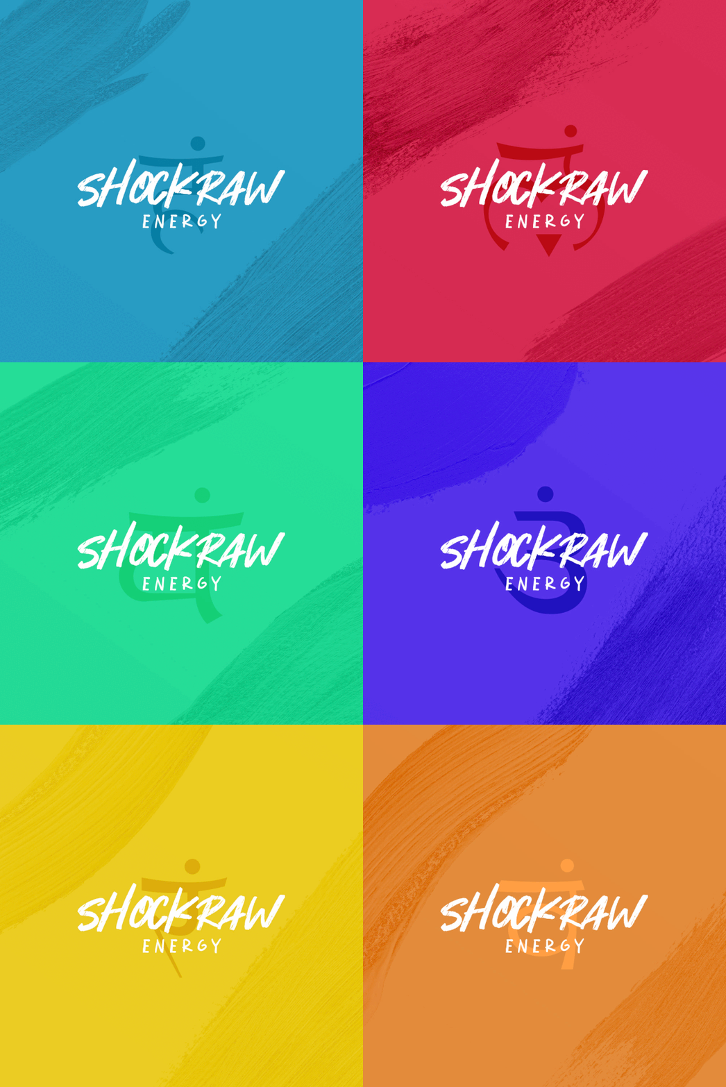
Keeping up with modern trends such as yoga and energy drinks, I combined the two into a unique brand of energy drinks based on the 7 chakras of the body.
BRAND DIRECTION
PRODUCT DESIGN
ORGANIC AND PAID SOCIAL
ICONOGRAPHY
-
As a fan of meditation and the idea of energy centers in the body, it clicked to me that chakras could be used as a brand for energy drinks due to their different colors and trendy activities such as yoga.
-
I began studying the different symbols of the Buddhist religion and their meaning/color significance to find patterns or similar symbols that could be leveraged.
-
I was immediately drawn to the “affirmations” that each chakra held as they gave greater meaning to each flavor as more than just a drink. The hand-drawn elements helped make the drink feel more natural while keeping elements of the brand identity intact.
Many of the key photographs and graphics were designed to showcase the drink with its key ingredients to promote the variety of flavors.
The organic social strategy was to focus on the key demographic of females aged 18-40 who live an active lifestyle and feature photos of models enjoying ShockRaw Energy.
VIEW NEXT PROJECT >
< VIEW PREVIOUS PROJECT


